Mastering Presentations: Tips on presenting your design to a client!
In our experience at Digital Nar, no two presentations are the same. The “right” way to present varies based on the client, the people involved, the project, and its stage. Here’s our approach to presentations, including the why, when, and how, to make them effective and engaging.
Why Present?
Presentations are an opportunity to meet with clients in person, set aside dedicated time, and walk them through our thought process, step by step. This approach helps clients understand the reasoning behind our decisions and clarifies their expectations and goals for us. Presentations are about educating, informing, convincing, and building trust—crucial for decision-making and gaining client support. The stronger the trust and relationship, the more freedom we have to excel in our work, leading to better outcomes.
How Often Should You Present?
It depends. Sometimes a few big presentations with substantial work in between are effective; other times, frequent informal check-ins work best. The right approach depends on the client relationship and your collaborative style.
1. A Few Big Steps
We start with an immersive phase to understand the client’s needs and wishes. After agreeing on an approach, we dive into a design phase, culminating in a big reveal presentation.
Pros: More time to focus deeply on the project and create well-thought-out, convincing presentations.
Cons: It may take longer to ensure alignment with the client.
2. Many Small Steps
This involves frequent back-and-forth communication, progressing in closer collaboration towards the first round of designs.
Pros: Closer alignment with the client throughout the process.
Cons: Less time for independent deep thinking and visualizing the project as a whole.
Balancing Simplicity and Excitement
One of the challenges in presenting well is balancing simplicity with excitement. Simplicity ensures your story is clear, while excitement keeps the audience engaged. Since “simple” and “exciting” can mean different things to different people, understanding your client before presenting can make a significant difference. At Digital Nar, our close relationships with clients help us tailor our presentations to their preferences, ensuring our message is both clear and engaging.
Building a Presentation
Now, let’s walk through how these principles come together in a design presentation.
1. Open the Door
Start with a story about your thoughts and insights around the brand or product. Share your research findings and initial ideas to set the stage for your creative process.
2. Set the Mood
Communicate what you want people to feel and understand when they see your design. Use reference material, like images or mood boards, to convey the desired emotions and themes.

3. Time to Impress
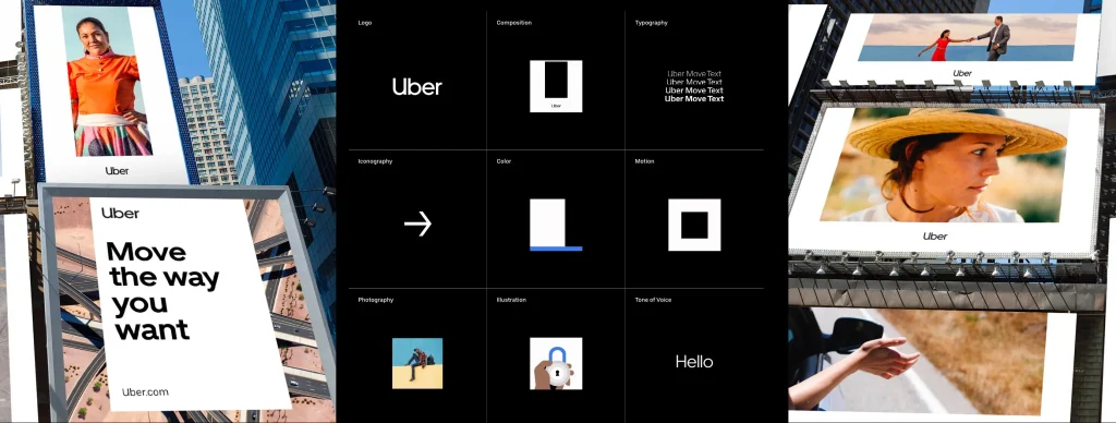
Present your design in its full context. Show website designs in a browser mockup or mobile frame, and outdoor ads in a real-world setting. Enhance the presentation with animations or videos to bring the design to life.
4. Break Down Your Design (But Not Too Much)
While it can be helpful to discuss individual design elements (colors, typography, shapes), remember that a design is the sum of its parts. Avoid dissecting the design too early to prevent premature reactions from the client.

5. Underpromise, Overdeliver
Set realistic expectations early on, but whenever possible, exceed them. Think of ways to add a little extra to your presentation, or as we say at Digital Nar, “bring the chocolate.”
A Final Tip: Rehearse
Presenting means telling a story while engaging an audience. Rehearse by writing down key points, timing yourself, and testing your presentation with a colleague to ensure clarity and impact.
Conclusion
Presentations are a vital part of our process at Digital Nar. By understanding the why, when, and how of presenting, we build trust and ensure successful project outcomes. Remember to balance simplicity with excitement, tailor your approach to the client, and always aim to exceed expectations.


